
Color Theory
Color Palette
CSS Utility Classes
1. What Is Color Theory?
Definition of Color Theory
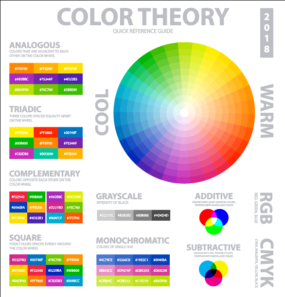
Color theory is a structured framework that explains how colors are created, how they relate to one another, and how they interact visually. It provides rules and guidelines for combining colors in a way that is visually balanced, harmonious, and meaningful. In design, color theory helps professionals make informed decisions rather than relying on guesswork.
Importance of Color Theory in Web Design, UI/UX, and Graphics
In web design and UI/UX, color theory plays a critical role in usability, accessibility, and user engagement. Proper color selection improves readability, guides user attention, and creates clear visual hierarchy across interfaces. In graphic design, it ensures consistency in branding, enhances aesthetic appeal, and supports the intended message or identity of a product or organization.
How Color Theory Supports Better Visual Communication
Color theory enhances visual communication by enabling designers to convey emotions, emphasize important elements, and create intuitive user experiences. Strategic use of color helps users quickly understand content, distinguish between actions and information, and respond appropriately to visual cues. When applied correctly, color theory transforms visual elements into a clear, effective communication tool rather than just decoration.
2. The Color Wheel
Purpose of the Color Wheel
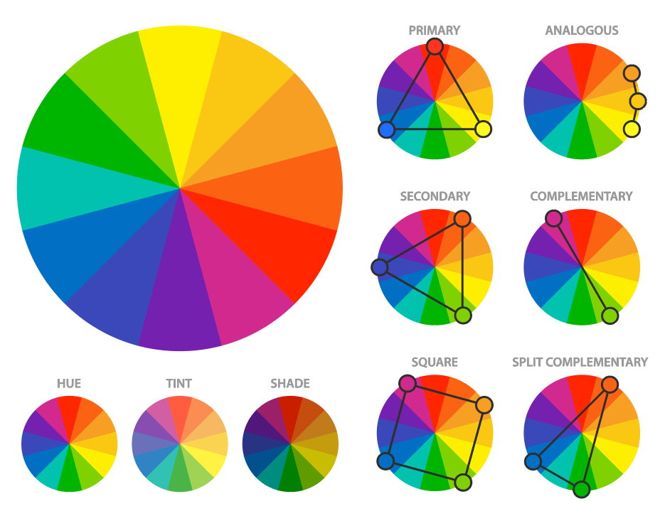
The color wheel is a visual representation of colors arranged according to their chromatic relationships. Its primary purpose is to help designers understand how colors relate to each other and how they can be combined effectively. By using the color wheel, designers can easily identify harmonious color schemes, create contrast, and maintain visual balance in design compositions.
Primary Colors (Red, Blue, Yellow)
Primary colors are the fundamental colors that cannot be created by mixing other colors. Red, blue, and yellow serve as the base for all other colors in traditional color theory. These colors form the foundation of the color wheel and are essential for creating a wide range of color variations.
Secondary Colors (Orange, Green, Violet)
Secondary colors are formed by mixing two primary colors in equal proportions.
- Red + Yellow = Orange
- Blue + Yellow = Green
- Red + Blue = Violet (Purple)
These colors occupy the spaces between primary colors on the color wheel and add depth and variety to color combinations.
Tertiary Colors (Red-Orange, Blue-Green, etc.)
Tertiary colors are created by mixing a primary color with a neighboring secondary color. Examples include red-orange, yellow-green, blue-green, blue-violet, red-violet, and yellow-orange. These colors provide more nuanced tones and are especially useful for creating smooth transitions and refined color palettes in design.
3. Color Properties
Hue – The Name of the Color
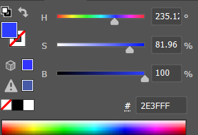
Hue refers to the basic identity or name of a color, such as red, blue, green, or yellow. It represents the position of a color on the color wheel and distinguishes one color family from another. Hue does not indicate how light, dark, or intense a color is; it only defines the pure color itself.
Saturation – Color Intensity or Purity
Saturation describes the intensity or vividness of a color. Highly saturated colors appear bright, rich, and vibrant, while low-saturation colors look dull, muted, or closer to gray. In design, adjusting saturation helps control emphasis, mood, and visual balance without changing the actual hue.
Brightness / Lightness – Light vs Dark Colors
Brightness (often referred to as lightness) indicates how light or dark a color appears. Adding white increases lightness, while adding black decreases it. Variations in brightness are used to create contrast, depth, and hierarchy in designs, making elements easier to read and visually distinguish.
4. Color Harmonies (Color Schemes)
Monochromatic – One Color, Multiple Shades
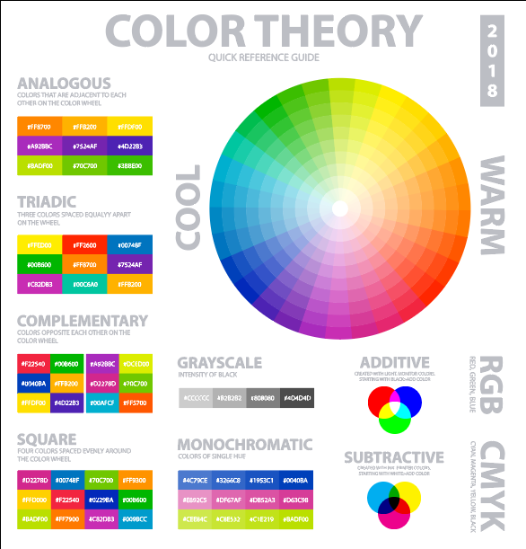
A monochromatic color scheme is based on a single hue, using its different shades, tints, and tones. This scheme creates a clean, cohesive, and visually consistent look. It is commonly used in minimalist designs where simplicity and clarity are priorities.
Analogous – Neighboring Colors
Analogous color schemes use colors that are placed next to each other on the color wheel, such as blue, blue-green, and green. These combinations feel natural and harmonious because the colors share similar characteristics. They are often used to create calm, comfortable, and visually pleasing designs.
Complementary – Opposite Colors
Complementary colors are positioned directly opposite each other on the color wheel, such as red and green or blue and orange. This scheme creates strong contrast and visual energy. When used carefully, complementary colors are effective for highlighting important elements like buttons, calls to action, or key information.
Split-Complementary
The split-complementary scheme is a variation of the complementary scheme. It uses one base color along with the two colors adjacent to its opposite on the color wheel. This approach offers strong visual contrast while being more balanced and easier to manage than direct complementary combinations.
Triadic
A triadic color scheme uses three colors that are evenly spaced around the color wheel, forming a triangle. This scheme provides high contrast while maintaining color harmony. It is suitable for vibrant and dynamic designs when one color is dominant and the other two are used as accents.
Tetradic (Double Complementary)
The tetradic color scheme involves two pairs of complementary colors. It offers a wide range of color variation and is best used in complex designs. To avoid visual clutter, one color is typically chosen as the dominant hue while the others are used sparingly for support and emphasis.
5. Warm and Cool Colors
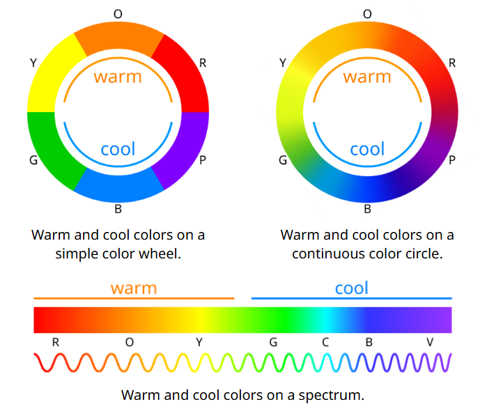
Warm Colors and Their Characteristics
Warm colors include red, orange, and yellow, along with their variations. These colors are associated with energy, enthusiasm, warmth, and action. Warm colors tend to attract attention quickly and can create a sense of excitement or urgency. In design, they are often used to highlight important elements and encourage user interaction.
Cool Colors and Their Characteristics
Cool colors include blue, green, and purple. They are generally associated with calmness, stability, trust, and relaxation. Cool colors create a soothing and professional appearance and are commonly used for backgrounds, informational sections, and interfaces where readability and user comfort are important.
When to Use Warm vs Cool Colors in Design
Warm colors are best used for calls to action, alerts, and elements that require immediate attention. Cool colors are more suitable for backgrounds, content-heavy areas, and designs that aim to convey reliability and ease. A balanced combination of warm and cool colors helps create visually engaging designs while maintaining clarity and usability.
6. Color Psychology
Emotional Impact of Common Colors
Color psychology studies how colors influence human emotions, perceptions, and behavior. In design, understanding these associations helps create interfaces and visuals that communicate the intended message effectively.
Red
Represents energy, urgency, and excitement. It is often used for alerts, warnings, and call-to-action buttons where immediate attention is required.
Blue
Symbolizes trust, calmness, and reliability. It is widely used in corporate websites, finance, and technology platforms to build confidence and professionalism.
Green
Associated with growth, balance, and nature. It is commonly used for success messages, eco-friendly branding, and health-related interfaces.
Yellow
Conveys optimism, positivity, and attention. It works well for highlights and notifications but should be used carefully to avoid visual strain.
Black & White
Represent contrast, simplicity, and clarity. Black adds sophistication and strength, while white creates openness and readability. Together, they form the foundation of clean and modern design.
Practical Relevance in Websites and Branding
In websites and branding, color psychology helps shape user perception and emotional response. Strategic color choices strengthen brand identity, guide user actions, and improve engagement. When aligned with brand values and user expectations, color becomes a powerful tool for communication rather than just a visual element.
7. Contrast and Readability
Importance of Contrast in UI and Accessibility
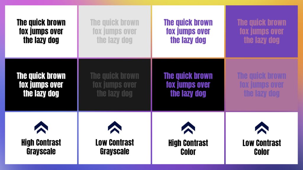
Contrast refers to the difference in brightness or color between elements. In user interfaces, strong contrast is essential for readability, usability, and accessibility. Proper contrast ensures that text, icons, and interactive elements are easily distinguishable for all users, including those with visual impairments. Good contrast improves comprehension and reduces user fatigue.
Text vs Background Color Selection
Effective text and background color combinations make content easy to read and scan. Dark text on a light background or light text on a dark background generally provides the best readability. Designers should ensure sufficient contrast between text and its background so that information remains clear across different screen sizes and lighting conditions.
Common Contrast Mistakes to Avoid
Common mistakes include using low-contrast color combinations, placing text over busy or patterned backgrounds, and relying solely on color to convey information. Overusing bright colors or pairing similar tones can also reduce clarity. Avoiding these issues helps create interfaces that are both visually appealing and functionally accessible.
8. Color Models Used in Web Design
RGB – Screens and Digital Displays
RGB stands for Red, Green, and Blue. This color model is based on light and is used in all digital screens such as monitors, mobiles, and TVs. Colors are created by combining different intensities of red, green, and blue light. RGB is ideal for digital design because it directly matches how screens display colors.
HEX – Web-Friendly Color Representation
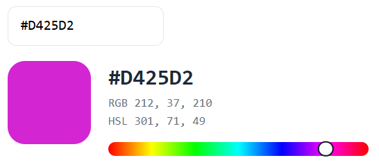
HEX colors are a hexadecimal representation of RGB values and are widely used in web development. A HEX color is written as a six-digit code (for example, #FF5733) that defines red, green, and blue intensity. HEX is compact, easy to copy, and commonly used in CSS and web design tools.
HSL – Human-Readable Color Control
HSL stands for Hue, Saturation, and Lightness. This model is designed to be more intuitive for humans to understand and adjust. Designers can change the color hue while controlling how vivid or light the color appears. HSL is especially useful for creating consistent color variations such as hover states, themes, and shades.
When and Why Each Model Is Used
RGB is used when working directly with digital displays and graphics. HEX is preferred in web development due to its simplicity and compatibility with CSS. HSL is chosen when fine control over color appearance is required, making it ideal for design systems and UI customization. Understanding all three models allows designers and developers to choose the most effective approach for different design needs.
9. Applying Color Theory in Web Design
Creating a Balanced Color Palette
A balanced color palette ensures that a website looks visually appealing without overwhelming the user. By applying color theory principles, designers can select colors that work harmoniously together, maintain proper contrast, and support readability. A well-balanced palette improves user focus and creates a professional, structured appearance.
Primary, Secondary, and Accent Colors
In web design, the primary color represents the brand identity and is used most frequently. Secondary colors support the primary color and add visual variety without dominating the design. Accent colors are used sparingly to highlight important elements such as buttons, links, or alerts. Clear separation of these roles helps guide user attention effectively.
Consistency Across UI Elements
Consistent use of colors across UI elements such as buttons, links, headings, and backgrounds improves usability and recognition. When similar actions share the same colors, users can quickly understand how to interact with the interface. Consistency also strengthens branding and creates a cohesive user experience across the website.
10. Practical Tips for Beginners
Start with Neutral Backgrounds
Neutral colors such as white, light gray, or soft beige provide a clean foundation for web designs. They improve readability and allow other colors to stand out without visual clutter. Neutral backgrounds are especially effective for content-heavy pages.
Limit the Number of Colors
Using too many colors can make a design look confusing and unprofessional. Beginners should limit their palette to a small set of colors, typically one primary color, one or two secondary colors, and one accent color. This approach ensures visual harmony and clarity.
Use Accent Colors Intentionally
Accent colors should be used sparingly to draw attention to important elements such as call-to-action buttons, links, or notifications. Overusing accent colors reduces their impact and can distract users from key actions.
Test Colors Across Devices
Colors can appear differently on various screens and devices due to display settings and lighting conditions. Testing designs on multiple devices helps ensure consistent appearance, readability, and usability for all users.